
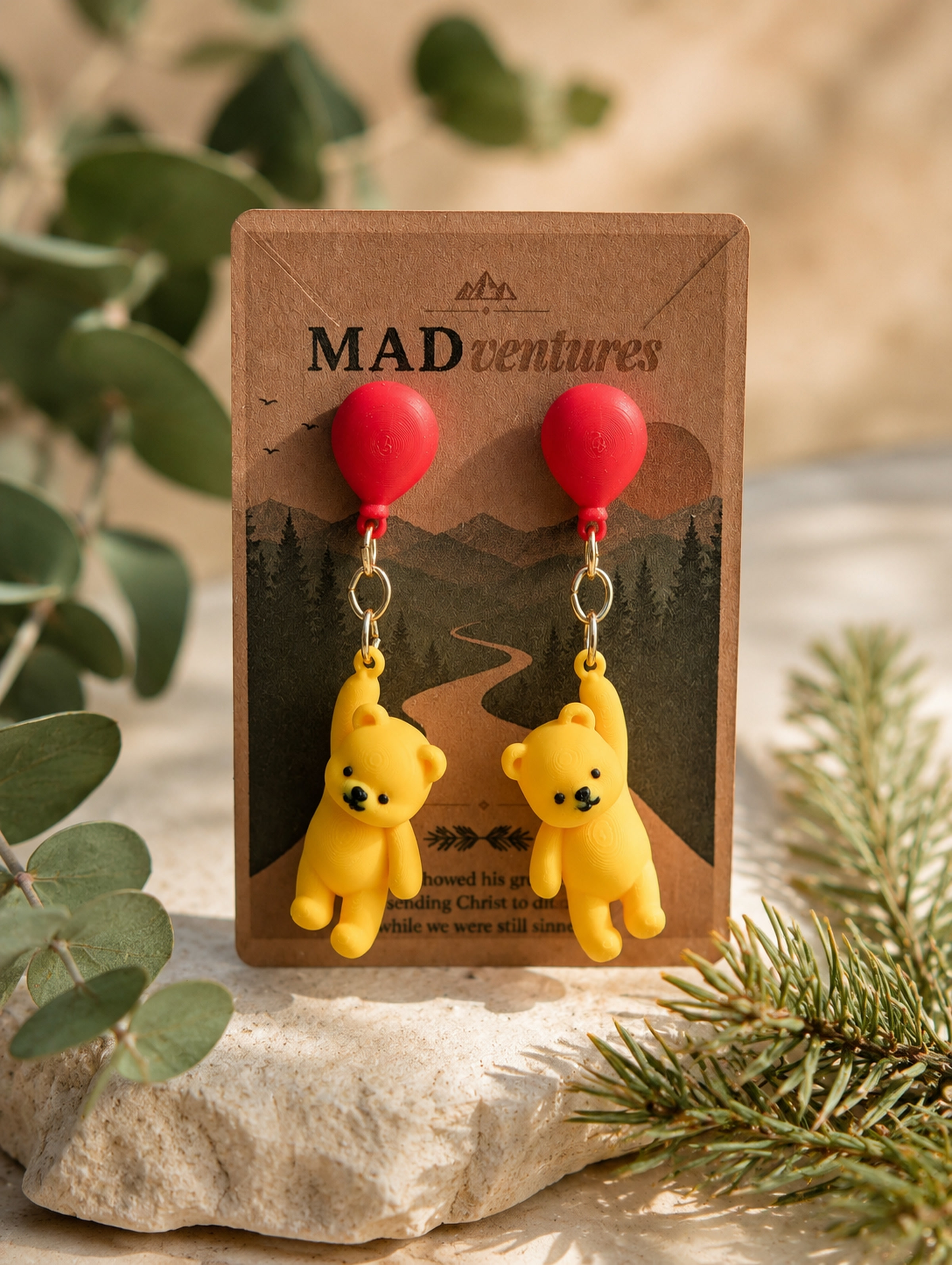
A product page converts when it reduces the distance between curiosity and confidence. The visitor needs to recognize the item, understand why it fits, verify the details, and see a safe next step. When those answers arrive in the right order, the page feels helpful instead of pushy.
Small shops often send customers to Etsy, Shopify, or another checkout platform. That does not make the website product page unnecessary. The website can carry brand story, original search content, category relationships, and deeper context that a marketplace template cannot always provide.
Lead with recognition
The first screen should answer three questions quickly: What is this? Who is it for? Why should I keep looking? Use the real product name as the main heading, show the current price, display an accurate primary image, and place the buying action near those details.
Avoid hiding the basic identity inside poetic copy. Personality belongs in the description, but recognition comes first. A title such as Fresh Balsam Soy Candle is easier to understand than a collection name with no product type. Keep the category link visible so the buyer can compare related items without starting over.
Build confidence with specific details
Confidence comes from concrete information. Materials, dimensions, options, care notes, fulfillment path, and return expectations should be easy to find. If checkout happens on Etsy, say so before the buyer clicks. If variations are selected on Etsy, do not show a decorative selector on the website that has no effect on the destination.
Use the description to explain both the object and the experience. Describe what the buyer receives, how it is made or sourced, where it works well, and what normal variation may occur. Specific, honest language is more persuasive than unsupported superlatives.
- Product type and intended use
- Price and current availability
- Materials, dimensions, sizing, or capacity
- Color, hardware, scent, or format options
- Shipping and return responsibility
- Care, safety, or made-to-order notes when relevant
Use images to answer objections
Every image should have a job. The hero image creates recognition. Detail images show finish and construction. Scale images reduce size uncertainty. Context images help the buyer imagine the item in use. Variation images prevent confusion between options.
A gallery should be easy to browse with a mouse, keyboard, or touch. Thumbnails should remain a predictable size rather than inheriting the original height of the source photograph. Opening a larger view should not trap the visitor or make the close control difficult to find.
For handmade and 3D printed products, honest close-ups are valuable. Showing the real surface and assembly details communicates care and sets accurate expectations.
Put the next step where confidence forms
The primary call to action should use direct language such as Buy on Etsy, View current options, or Add to cart. Keep one primary action visually dominant. Secondary links can lead to the category, related products, contact support, or a relevant guide.
When the action leads to another website, set expectations. The visitor should know that pricing, options, shipping, and returns are finalized there. This small note prevents the transition from feeling like an unexpected redirect.
Resolve objections in plain language
Useful product pages anticipate hesitation without turning into an oversized FAQ. A short shipping and returns section, an option summary, and a few product-specific highlights are often enough. If buyers regularly ask the same question, move the answer onto the page.
For giftable products, clarify presentation and timing. For apparel, prioritize size and care. For candles, explain size and scent character without making health claims. For earrings, show post material, weight, and approximate dimensions. Strong objection handling is specific to the category.
Support search without filler
Original descriptions, descriptive titles, category pages, internal links, alt text, and Product structured data help search engines understand the page. The copy should still be written for a buyer. Repeating the same phrase in every heading makes the page less readable and does not create authority.
Connect the product to the rest of the site. Link to its category, a relevant guide, related products, and a clear contact path. These links help visitors continue and explain how the catalog is organized.
Measure clarity, not just clicks
Conversion rate matters, but it is not the only signal. Watch for repeated support questions, quick exits, abandoned outbound clicks, and products that receive views without gallery interaction. These patterns can reveal missing information or a mismatch between the hero image and the offer.
Good conversion design is not pressure. It is the steady removal of avoidable doubt.
The strongest product pages feel calm because the information, imagery, and action all agree. The buyer can make a decision without being rushed or surprised.


